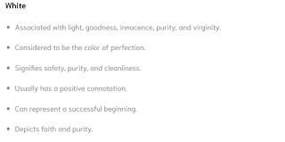
It is 11/4/19. My group and I discussed the font colors that we should use on our magazine cover. I looked various websites on color psychology to find the most appealing colors to our audience. I also looked at various fashion magazines, such as GQ, Complex, and Vogue, to see what types of font colors they used; I found that red, black, and white were the most commonly used colors, and according to Color Psychology.org, red is the most attractive color to the human eye; the color white is considered the color of perfection and has a positive connotation, hence why it is commonly used; however, black is considered to have a negative connotation but, according to Color Psychology the color black "Denotes strength and authority; it is considered to be very formal, elegant, and prestigious."


Today I also learned how to use the snipping tool on my computer. While doing research I wanted to post an image on my blog on color psychology but, since it was not a picture I could not copy and paste. After learning how to screenshot on my computer and snippet the the shot I was able to post the research that I found in my blog. This new skill could be beneficial towards my project because more than likely I will have to screenshot and snip another image or post to use for my blog, and/or use for my magazine.


No comments:
Post a Comment